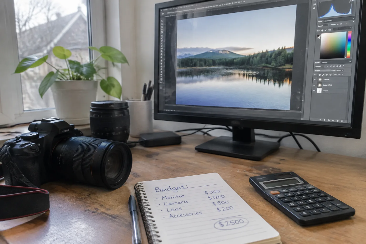
A monitor for photo editing is the one purchase where the spec sheet lies to almost everyone. Two panels can carry identical resolution, identical diagonal, identical advertised color gamut, and one of them will make skin tones look like they were shot under fluorescent office light while the other renders a face the way it looked in the room. The difference lives in places the marketing copy tends to skip, and it costs money in a specific order. Knowing that order is the whole budget exercise.
The short version of the argument: spend first on the panel type and its uniformity, second on a hardware calibration path, third on the stand and hood and ambient light control, and last on resolution and size. Most buyers do the reverse. They buy a big 4K screen with a wide-gamut sticker, plug it in, and wonder why their prints come back muddy. The money went to pixels instead of to the thing pixels sit on.
Why the panel technology decides the budget before anything else
Three panel families matter for photo work: IPS, VA, and OLED. VA has deep blacks and good contrast, which sounds ideal until a person tilts their head and watches the shadow detail shift. For still-photo editing that off-axis behavior is a nuisance, and for any color-critical judgment it is disqualifying. OLED gives per-pixel control and gorgeous contrast, but the current generation still carries brightness limits and a real risk of uneven aging when a fixed interface element sits in the same spot for months. IPS remains the workhorse: stable across viewing angles, predictable, and available in high-quality variants that hold their color across the whole screen.
The word "IPS" alone is not a quality guarantee. A budget IPS panel and a professional IPS panel share the label and almost nothing else. The professional part shows up in factory uniformity compensation, in a wider native gamut, and in the electronics that keep the backlight even. That gap is where the first serious money goes, and it is worth every dollar before a single pixel of extra resolution is bought.
Uniformity is the line item nobody advertises
Put a full white field on a cheap monitor and step back. The corners are dimmer. There may be a faint yellowish patch in one quadrant. On a spreadsheet that is invisible. On a photo of a white wall or a wedding dress, that patch becomes a decision: the retoucher dodges the corner to fix the monitor, and then the file is wrong everywhere else.
Uniformity compensation is the fix, and it is expensive because it costs yield. Panels that pass a tight brightness and color uniformity test are a smaller fraction of production, so the manufacturer charges for the ones it rejects. A monitor with a uniformity feature and a calibration report in the box is doing something a cheaper screen cannot. This is the single best place to put the first few hundred dollars. Buy less screen area and get a more even one.
Gamut coverage claims and the numbers that actually constrain a workflow
A monitor box will shout about a percentage of some color space. Adobe RGB, DCI-P3, sRGB, Rec. 2020. The percentages are almost always measured at a single point in the center of the screen and often at peak brightness, which flatters the result. A screen claiming 99 percent of Adobe RGB can still fail a real editing task if that coverage collapses toward the edges or if the panel cannot hold it at a comfortable working brightness.
The practical question is which space the work lives in. A photographer delivering to the web or to a print lab that expects sRGB needs a monitor that nails sRGB exactly, not one that overshoots it wildly. A photographer working in a wide-gamut print pipeline with Adobe RGB or ProPhoto RGB needs genuine wide-gamut coverage and, critically, a way to soft-proof what the narrower spaces will look like. A screen that covers a wide gamut but cannot accurately display sRGB inside it is a trap: every web image gets edited through a distorted window. The useful spec is accurate coverage of the spaces the files are actually delivered in, not the biggest number on the box.
The calibration hardware purchase that changes everything
No monitor arrives correct forever. Backlights drift, panels age, and the ambient light in a room changes with the season. A colorimeter or spectrophotometer and the software that drives it is the difference between guessing and knowing. This is not an optional accessory for serious work; it is the tool that turns a monitor into a reference.
Two paths exist. The cheaper path is a standalone colorimeter and third-party software, which works with almost any monitor and gives full control over targets, white point, and gamma. The pricier path is a monitor with built-in hardware calibration: the calibration data is written to the monitor's own lookup table rather than to the graphics card, so the profile travels with the screen and survives a computer swap. Hardware calibration is the more robust long-term choice, and it is usually bundled with the professional panels that already win on uniformity. Budget for one or the other. Skipping calibration to afford a bigger screen is the most common false economy in this entire purchase.
Resolution versus screen real estate for retouching
Higher resolution sounds free. It is not. At a given physical size, more pixels means smaller interface elements and, on many operating systems, scaling that either blurs text or eats GPU headroom. For photo editing, the more useful metric is pixel density in the range where a person can judge sharpening and noise without leaning in. A 27-inch panel at roughly 4K density is a sensible default; a 32-inch 4K panel trades density for area, which suits side-by-side comparison of before and after.
The retoucher's real need is room for panels, not the highest number. A 1440p screen at 27 inches leaves more usable workspace for a toolbar-heavy editor than a 4K screen at the same size running at 150 percent scaling. Resolution earns its money when it increases the amount of image and interface visible at once without shrinking the working area. Beyond that, the extra pixels are a tax paid in GPU load and eye strain.
Bit depth, lookup tables, and the banding that shows up in gradients
A smooth sky gradient is a brutal test. An 8-bit panel with a weak internal lookup table will show visible steps where the sky should transition evenly. A 10-bit panel with a well-managed LUT renders it clean. The spec to look for is true 10-bit or 8-bit plus FRC, and the honesty of that claim matters more than the label. Banding in a gradient is one of the few monitor flaws that is immediately obvious to a client, so it is worth paying to avoid.
This is also where the monitor's internal processing earns scrutiny. A panel that accepts a 10-bit signal but processes it through an 8-bit pipeline will still band. Manufacturers rarely advertise the internal pipeline depth, which is another reason the professional lines cost more: the electronics behind the glass are part of what is being bought.
The stand, the hood, and the room around the screen
A monitor hood looks like an affectation until the first time a window behind the desk throws a reflection across the panel. A hood costs a fraction of a panel upgrade and removes a class of errors that no amount of calibration can fix. It belongs in the budget early, not as an afterthought.
The stand matters for a duller reason: height and tilt. A screen set too high or too low changes the viewing angle, and on any panel with imperfect off-axis behavior that shifts the color. An adjustable stand or a monitor arm that puts the top of the screen near eye level is cheap insurance. So is a dim, neutral room. A single warm lamp bouncing off a glossy panel will undo a careful calibration in the same way a cold draft undoes a thermostat setting.
Where the last dollars should go, and where they should not
After panel quality, uniformity, calibration, and a hood, the remaining budget has diminishing returns. A slightly larger screen is pleasant. A higher refresh rate is irrelevant for stills. Built-in speakers, USB hubs, and fancy cable management are conveniences that should never outrank the panel itself. The money that would go to a bigger diagonal is better spent on the next tier of uniformity or on a calibration device that keeps the screen honest for years.
The purchase that ages best is the boring one: a modest-sized professional IPS panel with hardware calibration, a hood, and a colorimeter. It will not impress anyone on a desk tour. It will make every print match the screen, which is the only review that matters.
One concrete way to test a candidate before buying: bring a file with a smooth sky gradient and a file with a neutral gray card, view them full-screen, and walk from the center to each corner. If the gray shifts color or the gradient bands at the edges, the panel has told the truth about its budget. The spec sheet would not have.