Reading on a screen is a negotiation the eyes never quite win. A monitor built for video games pushes contrast and saturation until white pages glow like headlights; a monitor built for spreadsheets is often a dull gray slab that makes every paragraph feel like an obligation. The market has sorted itself into those two camps, and the person who spends six hours a day inside a PDF has been left to pick through the leftovers. That is the gap worth addressing directly, because the differences that matter for text are not the ones printed in large type on the box.
Text on a screen is a thin black line on a bright field. Everything about readability follows from that fact. The line needs to be sharp enough that the eye does not spend effort reconstructing letterforms, and the field needs to be calm enough that the eye does not flinch. Most monitor reviews spend their energy on color gamut and frame rates, which are real but secondary here. A document reader cares about pixel density, subpixel rendering, backlight uniformity, and the kind of anti-glare coating that turns a glossy panel into a matte one without turning it into a smear.
The pixel density threshold that actually matters
There is a practical floor for crisp text, and it sits around 140 pixels per inch at normal viewing distance. Below that, thin strokes on a 12-point font start to break up, the serifs go fuzzy, and the eye does the repair work. A 27-inch 1440p panel lands near 109 ppi, which is why so many people report that long documents on that size feel slightly soft even though the resolution sounds respectable. The same 27 inches at 4K reaches 163 ppi, and the difference is not subtle. Text stops being an image of text and starts being text.
The counterargument is scaling. At 4K on a 27-inch screen, a person runs the interface at 150 percent and ends up with the same amount of screen real estate as a 1440p display, only sharper. That is the correct way to use it. The mistake is buying 4K and running it at 100 percent to fit more windows, which produces a 163 ppi panel showing 8-point text and sends the whole exercise backward.
For laptops and smaller desks, 4K at 15 or 16 inches pushes past 280 ppi, well beyond what most eyes can resolve. The benefit there is diminishing, and the battery cost is real. A 27-inch 4K is the sweet spot for a dedicated reading setup. A 32-inch 4K sits at 138 ppi, right at the edge, and is fine for wide documents and side-by-side pages.
Matte over glossy, with a caveat about grain
A glossy panel reflects the room. In an office with a window behind the desk, a glossy screen turns every white page into a mirror with a paragraph printed on top. Matte coatings scatter that reflection, and for anyone reading dense text for hours, the reduction in glare matters more than the slight loss in perceived contrast. The trade-off is a faint sparkle on white backgrounds, sometimes called screen door effect, which shows up on cheaper matte finishes. It reads as a fine dusting over the page. Mild on a good panel, distracting on a bad one.
Apple's Nano-texture glass on the Studio Display is the current benchmark for this problem, though the price premium is steep and it is not available on every size. The Dell UltraSharp line and the BenQ models aimed at office work use a lighter matte finish that holds up well. A buyer should look at the screen in person if possible, ideally with a white document open, and check for sparkle from a normal sitting distance.
Why 16:10 beats 16:9 for documents
The standard widescreen ratio was designed for film, not pages. A 16:9 monitor at 27 inches is 23.5 inches wide and 13.2 inches tall, which is a letterbox. A 16:10 panel of the same diagonal gets roughly an inch of extra vertical space, and that inch is the difference between seeing a full page and scrolling to find the last paragraph. For anyone who works in Word, reads legal PDFs, or edits long-form copy, vertical real estate is the resource that runs out first.
This is why the 3:2 ratio used on Microsoft's Surface line and a handful of monitors has a small but devoted following. A 28-inch 3:2 panel is nearly square, and two letter-sized pages sit side by side without shrinking. The format has not caught on widely outside a few niche models, but it remains the most honest shape for document work. Buyers who can find one should seriously consider it.
The backlight uniformity problem nobody mentions
A bright white document is the harshest test a backlight can face. On a poorly built panel, the edges are dimmer than the center, or a corner has a faint yellow cast, or a vertical band runs down one side. None of this shows up in a game or a movie. On a full-screen white page, it is the first thing the eye notices, and it never stops being noticeable once it has been seen.
Uniformity varies unit to unit even within the same model, so reviews that test one sample tell only part of the story. The practical move is to buy from a retailer with a generous return window and check the panel on arrival with a solid white image at full brightness. Any banding, discoloration, or visible dimming at the edges is grounds for exchange. This single step prevents more buyer regret than any spec comparison.
Flicker, blue light, and the settings that help
Most LED-backlit monitors dim by pulsing the backlight on and off very quickly, a technique called PWM. At high frequencies it is invisible; at low frequencies some people perceive a faint flicker that produces headaches over a long session. The effect varies enormously between individuals, and the research on long-term harm is far from settled. The safe approach is to look for panels advertised as flicker-free, which use DC dimming instead, and to avoid running brightness at very low levels where PWM artifacts tend to be worst.
Blue light filters are oversold. The evidence that they protect the retina is thin, and the more reliable finding is that they help some people fall asleep more easily by reducing evening stimulation. A warmer color temperature after dark is reasonable; the aggressive orange filters that turn the screen into a sepia photograph are not necessary for reading comfort during the day. Better to run the monitor at a brightness matched to the room, somewhere in the 120 to 150 nit range for a typical office, and let the eyes relax.
Specific models that hold up under scrutiny
The Dell UltraSharp U2723QE is the workhorse pick for a 27-inch 4K. It has a 16:9 ratio, which is its main weakness, but the IPS Black panel produces deeper blacks than most office monitors and the matte coating is well judged. The built-in USB-C hub with 90 watts of power delivery cleans up a desk considerably. Text is crisp, uniformity is decent on good samples, and the price has settled into a reasonable range as newer models arrive.
For a step up in size and a better shape, the LG 28MQ780 DualUp is the odd one out and worth a look. Its 28-inch panel is nearly square at 16:18, which stacks two documents vertically without scrolling. The pixel density is lower than a 4K 27-inch, but the shape solves a problem that resolution alone cannot. It is a specialist tool, and buyers should treat it that way.
On the budget end, the BenQ GW2785TC offers 1080p at 27 inches, which is below the density threshold and will show softness on small text. It is fine for large-font reading and casual document work, and the price reflects the compromise. Anyone who stares at 10-point type all day should spend more. The Asus ProArt PA279CV sits in the middle, with 4K resolution, a matte finish, and calibration that is good enough out of the box for text work.
The desk setup changes the answer more than the panel does
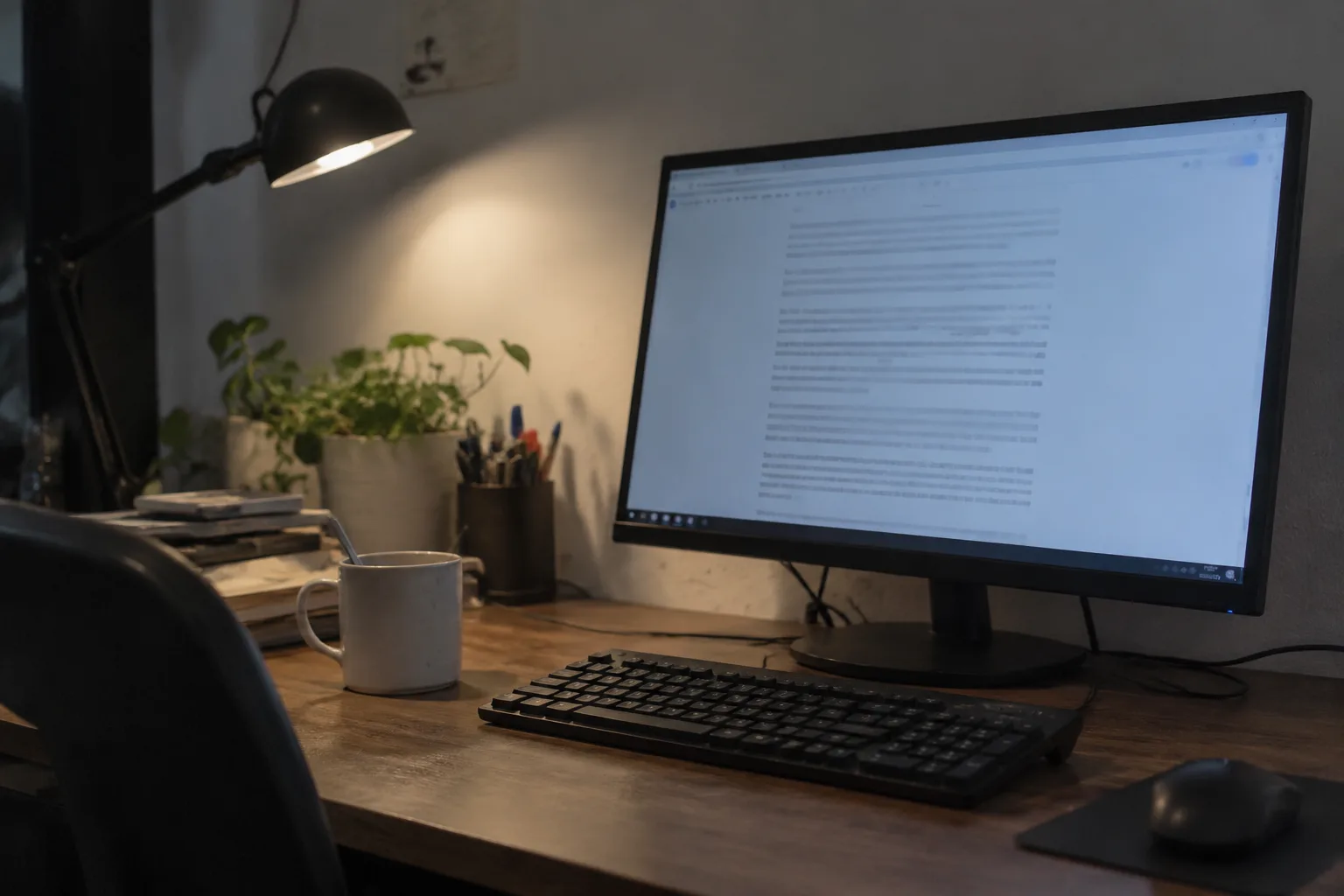
A monitor at the wrong height or distance undoes most of the specification sheet. The top of the screen should sit roughly at eye level, or slightly below, and the viewing distance should be about an arm's length for a 27-inch panel. A monitor pushed back against the wall behind a deep desk forces the eyes to work harder, and no amount of pixel density compensates for that strain over eight hours.
Ambient light matters just as much. A bright window behind the monitor creates a contrast mismatch that makes the screen feel dim; a dim room with a bright screen produces the opposite problem. A desk lamp with a warm bulb, placed to the side and angled away from the screen, gives the eyes a reference point and reduces the perceived brightness of the white page. This is the least expensive upgrade in the entire setup, and it is the one most often skipped.
Where the money goes and where it does not
A buyer can spend 300 dollars or 1,600 dollars on a monitor for reading text, and the difference in the actual reading experience is smaller than the price gap suggests. The essentials are 4K resolution at 27 inches or larger, a matte coating, a flicker-free backlight, and decent uniformity. Everything above that is refinement: better color accuracy for people who also edit photos, a taller ratio for people who work in pages, a USB-C hub for people who want one cable on the desk.
The one place not to skimp is the return window. Panels vary, and the only way to know whether a specific unit has a uniform backlight and a comfortable coating is to live with it for a week and look at a lot of white pages. A monitor that looks fine in a showroom can reveal a faint yellow corner the moment a legal brief fills the screen. The spec sheet gets a buyer into the right category. The return policy is what protects the purchase once it arrives.